Diagram creation (Plot)
ecu.test offers the possibility to create diagrams (plots  ) for used or recorded signals and analysis
results of a trace step. These diagrams will be added to the report.
) for used or recorded signals and analysis
results of a trace step. These diagrams will be added to the report.
The following figure shows the possible structure of a plot as it will be shown in the details view of the report:

Generated diagrams of an overview plot in ecu.test with upper plot (1), two separate plots (2) and lower plot (3)
A single plot may create multiple diagrams (hereafter referred to as sub plots). The sub plots of a plot are upper plot (1), separate plots or middle plot (2) and lower plot (3).
Info
If one only wants to display the graph of a single signal, then it should be assigned to the upper or lower plot. Empty sub plots are never displayed.
Info
Signals may be assigned to different Y-axes (4), see lower section signals.
Info
Displaying a signal in a separate plot suits signals that have only a few different signal values. In the above example binary signals are being displayed; in particular, the signal InMaxGear was used in a trigger condition.
If the plot is used in the context of a trace step or calculation or inside a trigger block, then the corresponding analysis results, i.e. found spots or ranges and trigger ranges are drawn into the diagram as colored rectangles. The above example shows the diagrams of a plot under a calculation trace step inside a trigger block. Such a plot allows for additional plots per trigger range and plots per found spot/range.

Continued example: Generated diagrams of a plot per trigger range

Continued example: Generated diagrams of a plot per found spot/range
Plot elements () can be added to a trace analysis by using the
button .
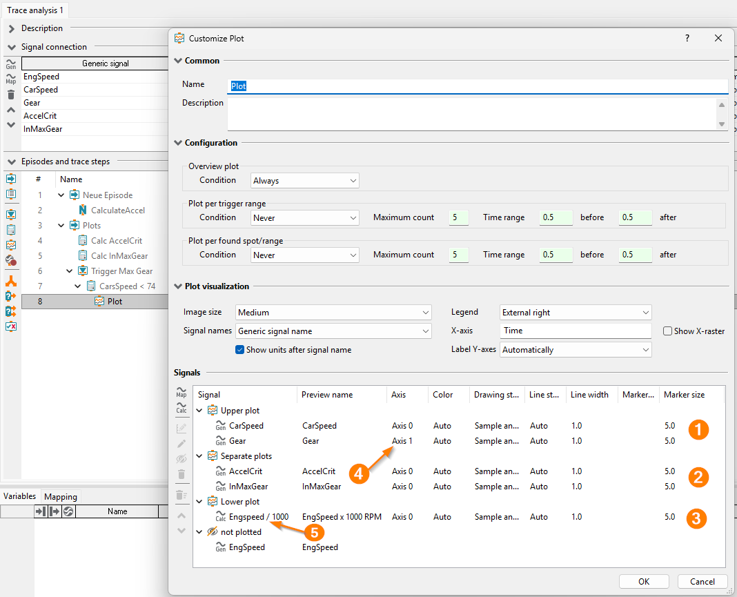
Continued example: Configuration of a plot used to create all diagrams shown. Upper plot (1), two separate plots (2), lower plot (3), additional Y-axis (4), calculated signal (5) - see section “Signals”
The dialog Customize Plot will be shown which has the following settings:
Common
Name of the plot which will also be used as the diagram title.
Description
Configuration
The Overview plot provides a general idea of all the selected signals. The limits of the X-axis are automatically determined in such a way, that all signals can be displayed completely.
The creation of the plot can be conditional. Restricting the number of plots to the relevant ones increases the clarity of the report and reduces the runtime of the trace analysis. A plot will be created if the verdict of the parent element meets the specified Condition. For instance, let the plot be attached to a calculation trace step. Then the condition FAILED or worse means that the plot will only be created if the calculation trace step is rated FAILED or ERROR. Possible options are:
Never
FAILED or worse
INCONCLUSIVE or worse
SUCCESS or worse
Always
The settings of the section Plot per trigger range are only active, if the plot is attached to an analysis step, that is used inside of a trigger block (for instance a triggered calculation trace step). Otherwise such plots that shall provide an overview within the separate trigger ranges can not be created.
Specifying a Condition for these plots works analogously to the overview plot. However, here the verdict of the trigger ranges must meet the condition.
It is possible to further reduce the Maximum count of plots per trigger range. The default value 5 means that only the first five trigger ranges that meet the configured condition are being plotted.
The depicted time range of a plot of this plot category can be extended using the parameters before and after. For instance, if a trigger range starts at 1.0 and ends at 2.0, then with the parametrization before=0.5 and after=0.8 the X-axis of the corresponding plot will have values between 0.5 and 2.8.
All the settings of the section Plot per found spot/range are completely analog to the ones of the previous section Plot per trigger range. However the former refer to found spots or ranges. Here settings can only be made, if the plot is attached to an analysis step that defines found spots or ranges. Otherwise no detail plot will be created.
The verdict of the found spot or range must fulfil the specified Condition.
Specifying a Maximum count restricts the overall number of detail plots possibly originated within different trigger ranges. The default values 5 means that only the first five found spots/ranges that meet the configured condition will be plotted.
Again the parameters before and after can be used to define (found spot) or extend (found range) the time range, i.e. the range of values along the X-axis.
Info
If the plot is attached to an analysis step that defines found spots or ranges (for instance a calculation trace step with activated evaluation), then these are shown in the overview plot or in plots per trigger range (if present).
Plot visualization
The Image size can be used to specify the minimum size of the created image. (The exact image size results from the number of subplots, in particular from the number of signals in separate plots).
The minimum sizes are:
Large: 800 x 600 Pixel
Medium: 640 x 480 Pixel
Small: 320 x 240 Pixel
Signal names indicates which source will be used to get the signal names. By default generic signal names will be used to ensure the comparability over the whole trace analysis. If the plot has to only represent the trace step by itself the internally used signal names of the trace step can be used. If generic signals of a signal recording or additional displayed generic signals (e.g. an in beforehand calculated signal that is displayed for comparison purposes) are plotted they will get an appropriate marking if actual signal names of a trace step should be used.
By default Units of signals are shown behind the signal name. This can optionally be deactivated.
By changing the setting Legend it is possible to vary the location of it.
For the X-Axis an axis title can be chosen and Show X raster may be activated.
Label Y axes can be turned on and off. By default, this is automatically chosen. If only one Y-axis exists and a legend is shown, the Y-axis is not labeled.
Signals
This section contains the management and configuration of the signals to be plotted. You can attach
signals to sub plots by drag and drop, the up and down buttons on the left side or via context menu.
Sub plots without signals are not plotted.
The options for Y-axes of sub plots are reached through double click on the sub plot node, click on
the Configure axes button  or via context menu
(see also Configure Y-axes)
or via context menu
(see also Configure Y-axes)
The Upper plot and the Lower plot are normal sub plots, which are suitable to plot all kinds of signals. For adding a separate Y-axis (4), open the context menu at the Axis column of a signal and choose a new axis.
Separate plots are special because a small sub plot is created for each signal. Therefore, they are suitable to plot status and trigger signals with few states. Y-axes can be can be configured to create an individual axis appearance for one or more separate plots.
The Separate Plots can be converted into a Middle Plot via the context menu. This sub plot behaves like the upper and lower plot.
Generic signals  can always be plotted. If a plot is beneath a trace step template then also
signals from template
can always be plotted. If a plot is beneath a trace step template then also
signals from template  can be used.
In addition to generic signals it is possible to display calculated signals. For this purpose the
 button in the left toolbar can be used.
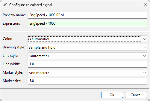
Dialog for the creation of a calculated signal
In the dialog shown above, any Python expression can be input in the field expression.
Additionally, references can be made to all available generic signals and
signals of trace step templates . This facilitates the
representation of multidimensional, complex or structured signals.
It is also possible to use package variables, global constants or any other constant expression without generic signals for that matter. Constant expressions will be drawn as a straight horizontal line spanning either the common time axis of the other signals in the plot or if none are available the common time axis of the parent episode instead.
In the field Name an optional preview name for the label in the legend can be selected. If the name is left empty, the expression itself will be selected as the label in the diagram legend instead.
Signals used in the parent element are always printed in bold font. Signals used in the elements above the parent element are printed in italic font. If a plot is moved or copied beneath another trace step or recording, then updating the configured signals to the signals in the new context might fail. Such signals are written in red font while editing a plot with missing signals for the first time. In order to preserve style settings of missing signals, one can apply their style to an existing signal through Apply style from in its context menu. By closing the dialog with OK, all red marked signals are removed.
For each signal the following settings are possible:
Enable/disable signal for the plot.
Color (is chosen automatically by default).
Draw style, how a signal will be drawn between to samples.
Line style, how the line itself will be drawn.
Line width.
Kind of marker.
Size of the marker.
Info
Configured style settings for not to be plotted signals will be deleted after clicking on the button OK.
Info
Only signals of identical type can be plotted on one y-axis, i.e. either only numeric or textual signals. For signals of different types, different axes or plots have to be chosen.
Configure Y-axes
Following options are available to configure the Y-axes of a sub plot:
The Numeric system per separate Y-Axis may be adjusted. Decimal is chosen as default. Additionally the options for Binary and Hexadecimal are available.
For enumerated signal values it might be better to show the Textual values instead. In this case the Scaling option is unavailable (see below). When Textual and Numeric are both selected then the numeric value will be added in parentheses with the chosen numeric system after the textual representation.
If additionally the option Combine values without explicit text representation is set all signal values without a corresponding textual value will we summarised next to the “no repr” tick marker. To improve the clarity of the axis labeling for long text values, you can use the Shorten text option to specify whether and how text values are to be shortened automatically.
Textual signals will be plotted regardless of the Numeric checkbox. The individual text values are plotted alphabetically from bottom to top on the Y-axis. For long texts it is possible to automatically shorten them by activating the Textual checkbox and choosing an option in the Shorten text menu (in the same way as for enumerated signals).
The Scaling may be adjusted per separate Y-axis.
If you set the scaling to Manually, the value range of the axis can be set (restricted or extended) by the input fields Y-Min and Y-Max.
If you set the scaling to Automatically, the value range is automatically determined so that the complete signal can be displayed. The lower limit of the Y-axis is set slightly below the minimum signal value and the upper limit slightly above the maximum signal value. In addition, in the input fields Y-Min and Y-Max, you can restrict the value range on one or both sides in order to display only a part of the signal. (The limits of the Y-axis are slightly above or below the specified values again). In automatic mode it is not possible to extend the displayed range. (If Y-Min is smaller than the smallest signal value, it will be ignored. Similarly, Y-Max will be ignored if it is larger than the largest signal value).
Y grid for the first axis can be made visible. The default setting is Not visible. For the grid width, you can choose between Automatically and Manually. In the latter choice, a concrete grid width has to be entered in the edit field beneath. If this setting generates a high number of grid lines, a multiple of this value is chosen. If this setting generates fewer than three grid lines, the grid width setting is ignored and grid lines are drawn automatically.
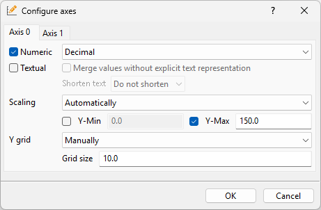
Dialog for the configuration of Y axes.
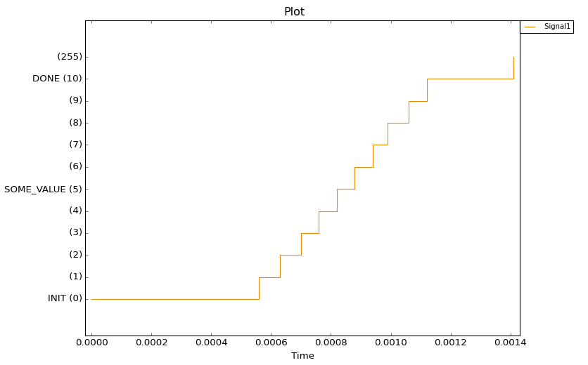
Example: Plot of an enumerated signal with the options Numeric and Textual set.¶ |
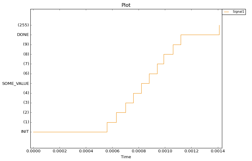
Example: Plot of an enumerated signal only with the option Textual set.¶ |
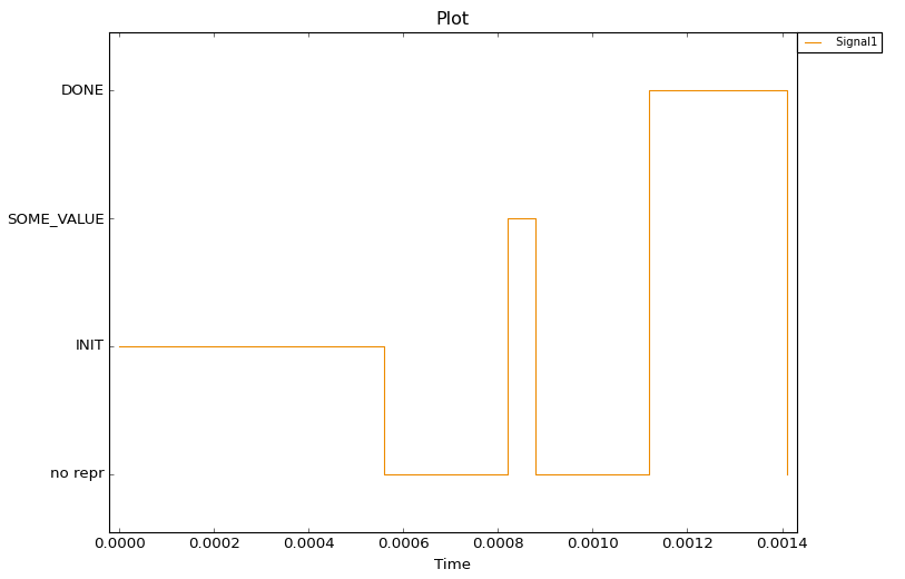
Example: Plot of an enumerated signal with the options Textual and Combine values without explicit text representation set.¶ |
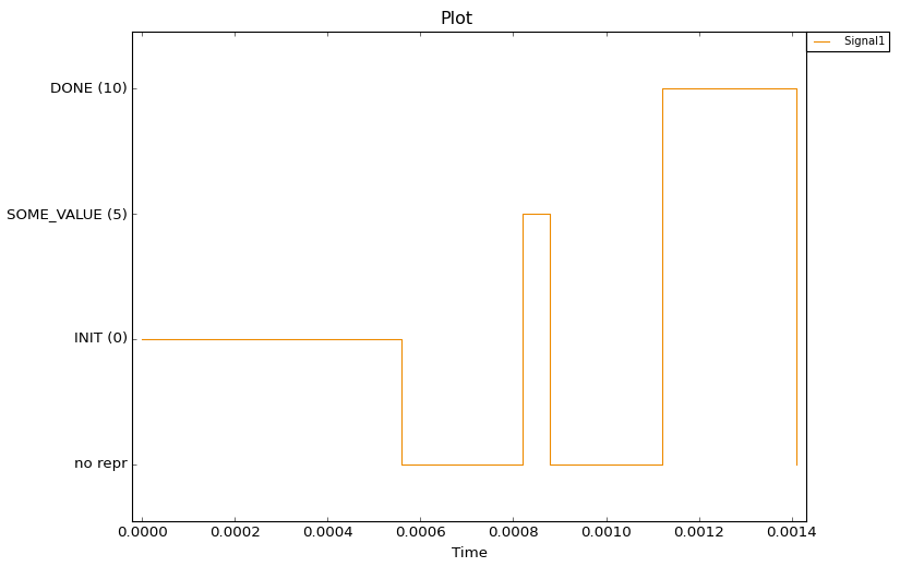
Example: Plot of an enumerated signal with the options Numeric, Textual and Combine values without explicit text representation set.¶ |
Resulting visualization in the report
After running the trace analysis a report entry for the plot element will look like the following example:

Example: Overview plot in the report for the tracestep CheckSignalInEnvelope.
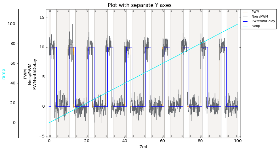
Example: Plot with separate axes
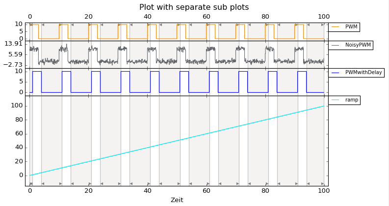
Example: Separate plots and lower sub plot